Journal | July 2024


Feature | New Zealands Best Homes


Watch live on 14 July 2024, 7:30pm on TV1

Or watch on TVNZ on demand

New Zealand’s Best Homes is a 6 part series presented by Phil Spencer.

It’s a real privilege to be included in this series showcasing 18 homes in New Zealand over 6 episodes. Phil Spencer was a charming character to meet and had an extraordinary quality of being able to develop instant rapport with people. He was also a true professional and took the time to write notes, think for a moment or two and develop a script and angle. It was such a pleasure to work with Phil and the whole team at Perpetual Entertainment.

Special thanks to the clients for making this such a smooth experience. The following are the details of the TV show.

It will also be available through “TVNZ on demand” after the initial screening.

EPISODE 6 with Volcano House will air on

SUNDAY 14th July 7.30pm on TVNZ 1.

Please find the supertease for the series here which you can share. 

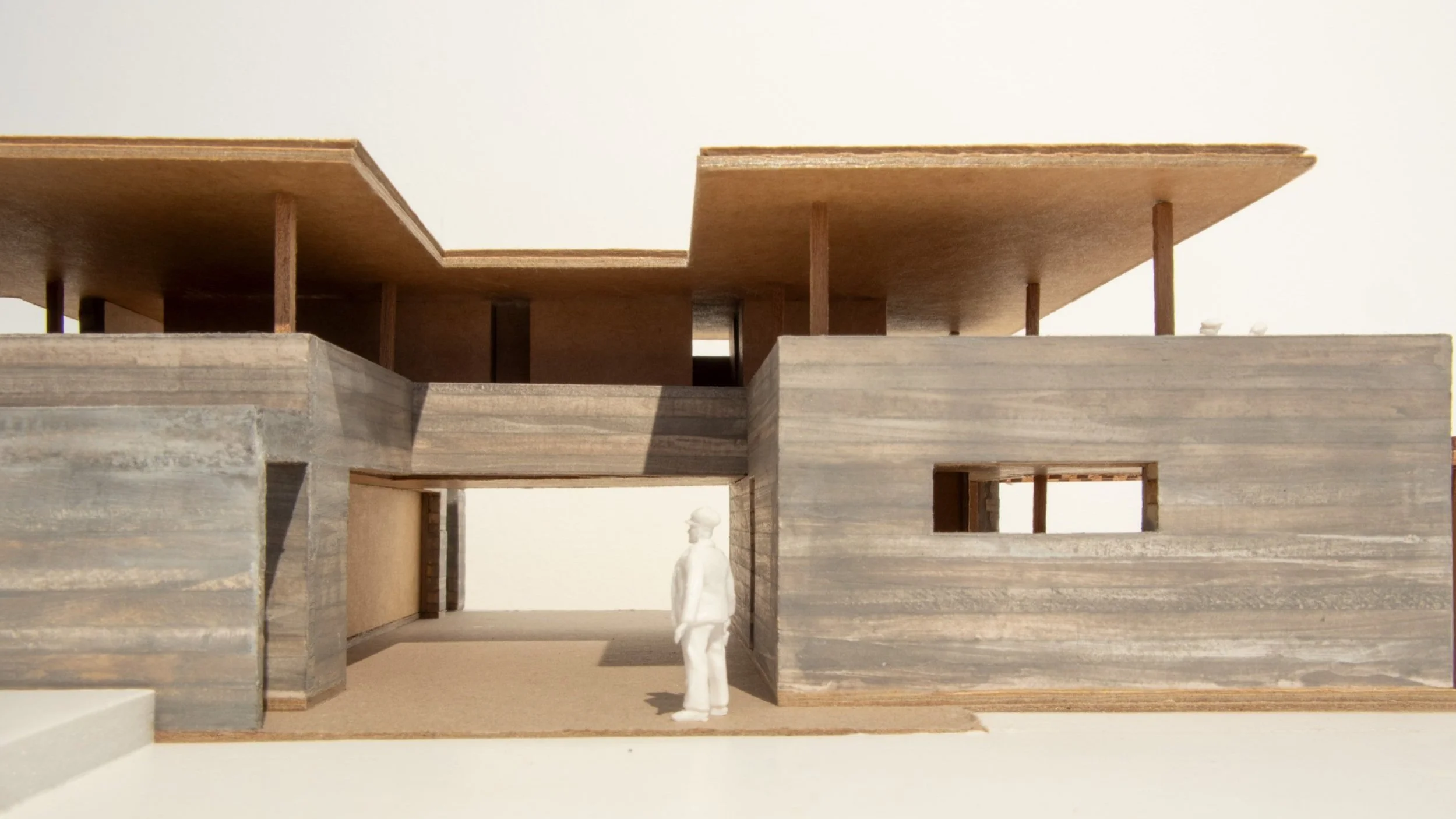
You’ll see a picture of Tom looking close up at a model.

Read More about this project…

Watch ‘New Zealands Best Houses’ here…


Journal | June 2024


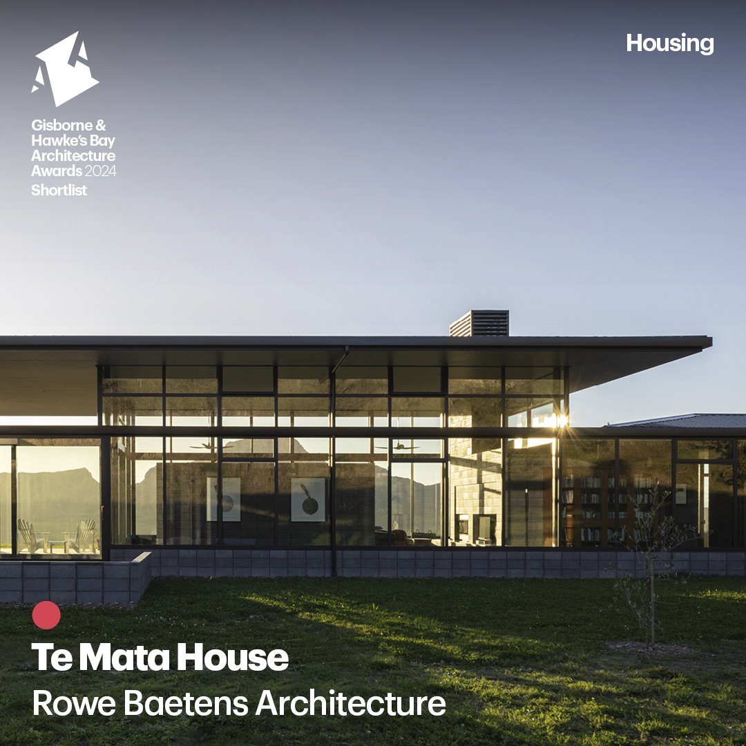
Te Mata House | Shortlisted


Hawkes Bay New Zealand Institute of Architects Awards,

Shortlisted Housing Category, 2024

It was a real privilege to be shortlisted for this award in the Hawkes Bay and we celebrated this with the clients in Hastings. They are originally from Germany and have lived in New Zealand for the last 15 years, moving only recently to the Hawkes Bay. The project had a high level of discipline and consistency.

We designed the house utilising a New Zealand made charcoal concrete block that had a South Island river stone aggregate. The blocks provided structure, cladding, and interior linings.

Pete from BNL Construction was fastidious in delivery and worked tirelessly to create a home that was unique as opposed to the Hawkes Bay “barn style” of construction.

Read more about this Project…


Journal | June 2024


Waiheke House | Featured in Home Magazine


“There is a refined level of architectural simplicity here. Two storeys of glass, steel, and concrete block, carefully set between a hill and the vast views of the ocean. That level of transparency has meant the interior has been kept linear and uncluttered, with the few aesthetic moves — such as stairs, inbuilt furniture, kitchen, and hearth — enjoying a Donal Judd–like simplicity of geometry and materiality.”


“Just as the circulation and social spaces are all arranged around the impressive glazed wall, the more private areas have been nestled into the hillside, where a type of cuboid concrete block form reads as a strong shelter, cocooned from the light-filled, openness elsewhere.”


Journal | March 2024


Inner Character | Under Construction

Character (noun) Etymology: The term "Character" can be traced back to the Greek word charassein, which conveys the meanings of "to sharpen, cut in furrows, or engrave." From this root, the Greeks derived the word charaktēr, denoting a "mark" or "distinctive quality."


Carved into the Milford landscape, this residence is a testament to the client's love for Italian stone architecture, extending out to lighter, open and uninterrupted living areas. The 'S' shaped plan maximizes the surface area of glazing to create two courtyards of light, pooling with natural illumination. The plan also delicately balances privacy with urban engagement.


Catering to the lifestyle of a couple seeking a timeless sanctuary, the design offers ample space for entertainment while seamlessly integrating with the street. Emphasizing compression and expansion, both vertically and horizontally, the unique shape enhances the permeability of natural light into the living areas. Conceived as a solid block of travertine, the exterior is notched or carved out to create living spaces. Stone is assembled in stratum-like sedimentary layers and mechanically fixed to a concrete structure.


The ground floor houses a self-contained minor dwelling, providing flexibility for hosting or potential rental income, seamlessly integrated into the sloping site alongside the garage, lift, and utility spaces. A planted pergola enhances the outdoor living experience, softening the home from the street, adding layers of privacy and a tactile contrast to the stone.  The upper level forms a bridge-like structure, providing shelter while enhancing airflow and natural light.


Ascending from the cobblestone entry court, a stone staircase is notched into the landscape, leading to the main living spaces. This offers seamless transition from the outdoors to the indoor areas. The journey is accentuated by an outdoor segment of the staircase, visually connected to an internal gallery through a glazed curtain wall. The top floor, a platform of social and private spaces, opens the inside to the outside through a continuity of materials and a hovering roofline above a ribbon of glass.


Covering an internal area of 270m², this level hosts the primary living spaces, settled in an ethereal atmosphere created by wide eaves, broad roofs, and strategically placed slot windows that screen the surroundings while inviting an abundance of light.


The house offers a retreat within the city, providing options to enjoy peaceful courtyard spaces or embrace the liveliness of the surrounding context. The materiality and detailing emphasize the solidity and stability of the stone to establish and reinforce a strong connection with the landscape.


Journal | June 2023


Cape to Bluff Feature

Volcano house as featured in landmark new Book ‘Cape to Bluff’


We're honored to share that 'Volcano House' is among the 30 homes featured in 'Cape to Bluff' by Simon Devitt and Andrea Stevens. This book journeys through Aotearoa, showcasing homes that reflect a deep connection to their surroundings and communities. Being included is a humbling acknowledgment of our approach to architecture that seeks to respect and respond to the unique character of each site and its people.


The volcanic cone of Maungauika North Head is the backdrop to this quiet suburban site. Accessed from a small laneway and surrounded by two-storey houses, the land is largely inward-looking. Architect Tom Rowe has responded to this context with a sophisticated courtyard house, where every corner of the site been considered, detailed and wrapped into the composition. 


The weight of the mountain and the arc of the sun informed the placement of each building element and open space. Views of Maungauika are ever present, and the mountain guided the materiality of the building. ‘We sourced South Island basalt to bring permanence, mass and solidity,’ says Tom, ‘and timber for its softness and contrast. The third material is the glazing, which opens the interior to a series of micro-landscapes and “frees” the roof from the walls to create a balance between lightness and gravity.


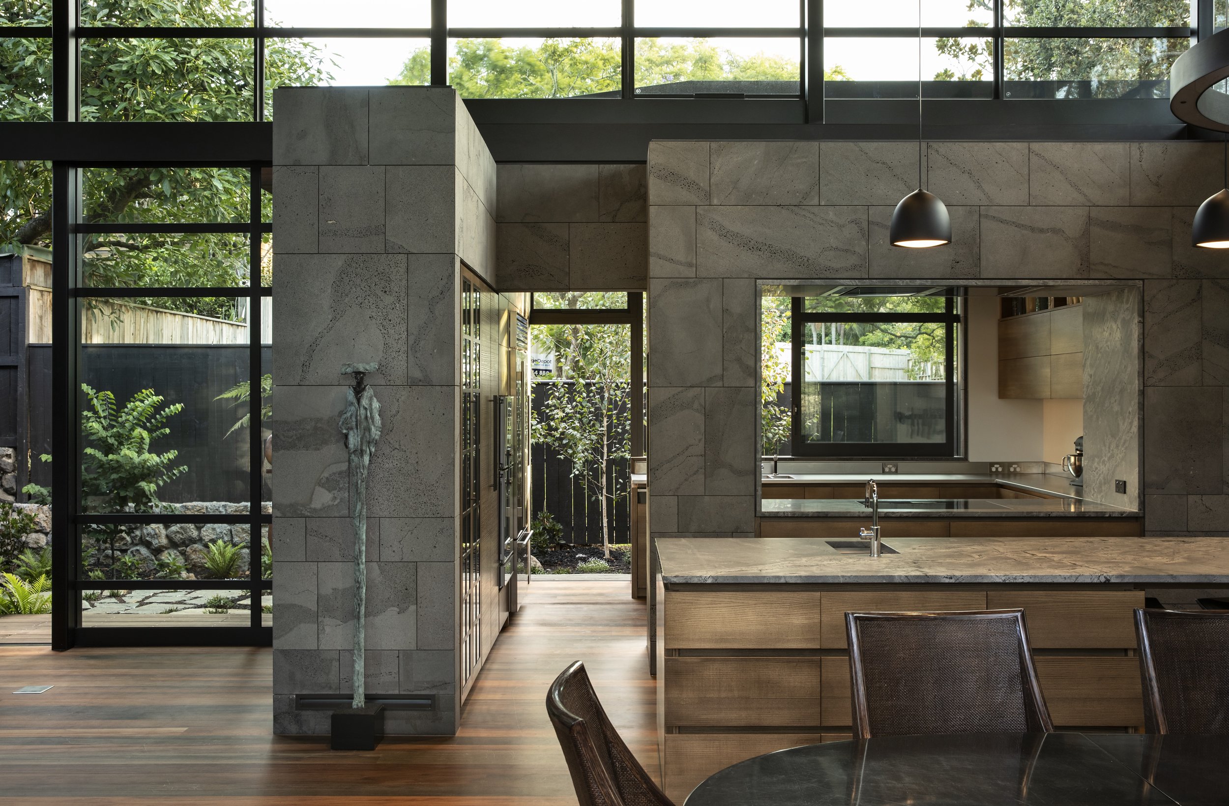
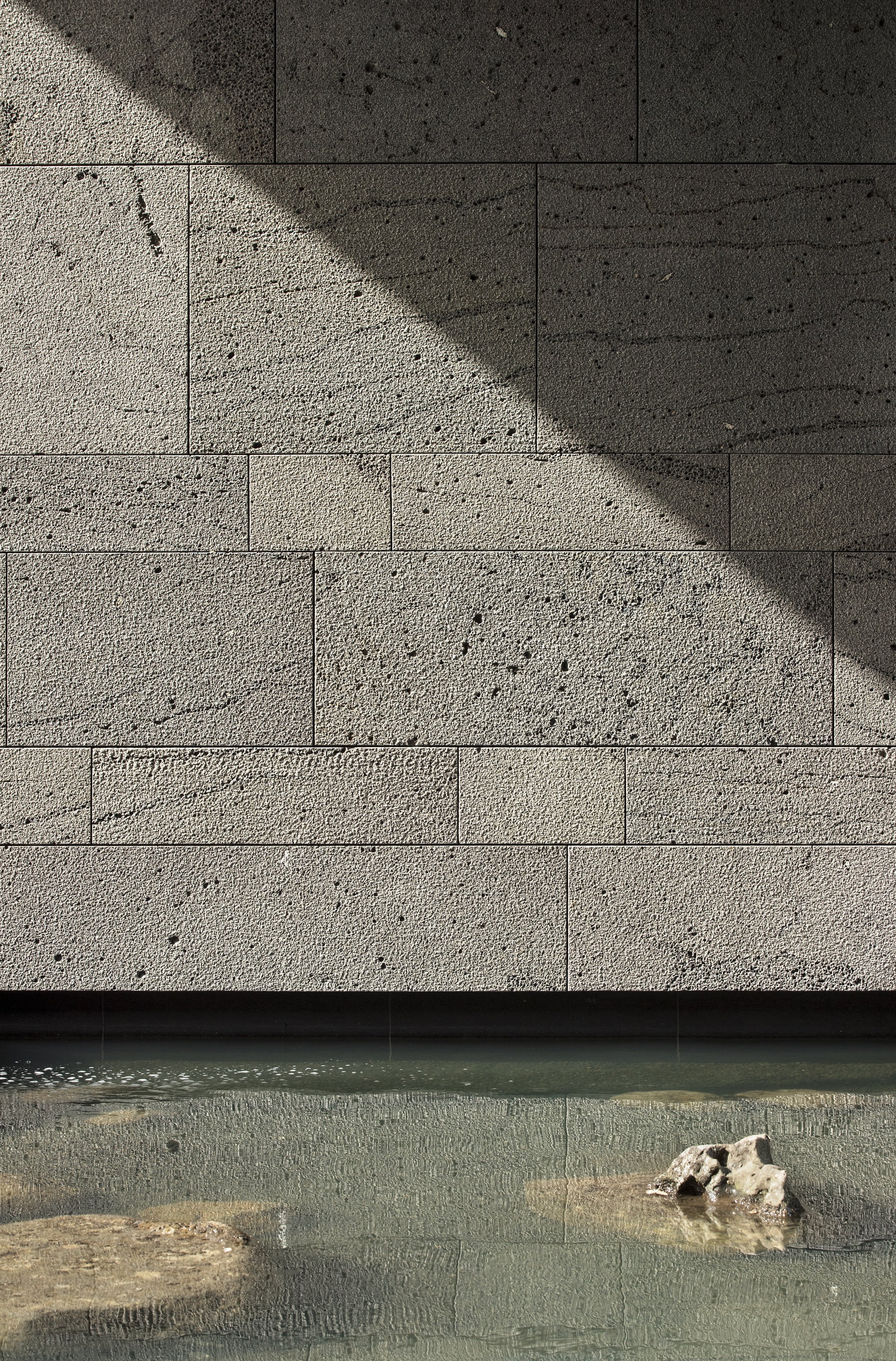
Referencing the surrounding environment, the house is conceived as a collection of boulders in the landscape and translated into four stone-clad pavilions – the garage, kitchen and laundry, bedrooms and bathrooms. The basalt cladding wraps from the exterior to the interior, shifting in texture from a rough finish outside to smooth inside. Corridors and living spaces are located between and around these forms, beginning at the entrance gallery, expanding in scale to create the main living area, and dropping down in scale again in the main bedroom wing. Courtyards connect the house to all points of the compass for a sense of expansiveness and outlook, while maintaining privacy from neighbours.


Informed by ancient stone architecture and the local landscape, there is a sense of the eternal in this house. Tōtara and rimu logs felled a century or more ago, salvaged from riverbeds in Te Tai Tokerau, were milled for ceilings and floors. The basalt was quarried from lava flows near Timaru. Echoes of the bush resonate throughout. ‘Ancient sites change you,’ notes Tom, ‘and they have profoundly transformed the way I understand and think about space. I look to balance a sense of the present – the everyday – while alluding to something older and timeless.’


—Images by Simon Devitt and text by Andrea Stevens.


Journal | January 2024


NZIA Auckland Architecture Awards - 2023

Designed in association with Noel Lane Architects - Swallow Point House is a winner in the NZIA Awards


We are excited to share that our architectural work ‘Swallow Point House’ has been recognized with the NZIA Auckland Architecture Housing Award. This achievement underscores our dedication to thoughtful design and practical innovation. We are grateful for our collaborative team, and our trusting clients.


This accolade motivates us to keep pushing boundaries, redefining aesthetics, and contributing meaningfully to the built environment. Looking ahead to more opportunities to shape architecture with creativity and purpose.


Journal | January 2022


TE MATA HOUSE - UNDER CONSTRUCTION

Deliberately immersed in the environment, this house exudes a sense of lightness and gravity, acknowledging the moods of the adjacent mountainscape. 


Situated within a climate of hot, dry summers and cold winters, with beautiful mists that can hang in the valley, this three-bedroomed home is designed to encompass views of Te Mata Peak and the Tukituki Valley. Here, foliage softly meets the rock of the mountain, an experience we have sought to emulate in this house – as if the dwelling has grown out of the rock itself. Calling to mind an ancient Tibetan monastery, this idea of a building emerging from the rock led us to create a unique connection with the site.


Avoiding the local typology of barn and shed-style homes – which rest on the site, rather than within it – we posed the question, ‘how can you live immersed in the landscape without being outside?’ In response, we have avoided the obvious wraparound deck and instead brought native grasses right up to the house’s edge.

Low concrete block walls emerge from the ground to create snug outdoor seating areas, while low windowsills allow the surrounding landscape to brush up against the buildings.


Topographically, the one-hectare site features a raised plateau, sheltered with a hill behind, providing comfort, a sense of security and privacy. Responding to this context, the roof plane extends some distance from the house edge – a deep eave for protection from the elements and a device used to extend the interior volume and the feeling of retreat inside. Beneath this generous roof, honed concrete block walls contain the volume of each room.


In the main space, a 4.3 metre-high stud gives lightness and drama to daily living. Window joinery is set into the ceiling, allowing an almost seamless surface as the roof plane moves from inside to outside. At each end, two full-height fireplace flues provide structural bracing for the main volume, enabling delicate steel posts and large expanses of double-glazing to make the living spaces feel as if they could almost be outdoors. 


Lower ceilings in the corridors and bedrooms provide contrast as you move through the house between compressed and expanded volumes.

The house circulation is conceived as a classical cloister rather than a hallway. Occupants move between the cloister (or gallery), which links bedrooms and living rooms. There is a subtle shift in the sense of private retreat versus access to the broader, open landscape.

The Te Mata house is an exercise in balance. It had to be comfortable during the hot, dry summers, and also when temperatures drop below zero in winter. The ever-present view of the mountain is framed in every room, so the inhabitants feel the power of the site, while sheltered and embraced by its deep, broad roof. 


Journal | August 2021

WAIHEKE HOUSE - UNDER CONSTRUCTION

Elevated and panoramic living is balanced by privacy and retreat through careful material and spatial handling.


Waiheke’s steep terrain creates the twin opportunities to bed down into the hillside and embrace a big landscape and view. This site in Church Bay allowed us to balance these experiences of enclosure and expansiveness in a new two storey, three-bedroom house. Defined by economic materials and efficient detailing, our design aimed for clarity in the spaces and structure. Utilising steel, plywood and solid timber, we’ve shaped elegant, domestic interiors that resonate with their bush and beach setting.

 
IMG_1429.jpg
 

Entry is through the ground floor, past guest bedrooms and a small lounge, to reach the living floor via a central timber staircase. A concrete-block cube cocoons the main bedroom suite, a private and intimate space that has acoustic separation from the main activity of the house. 

The elevated top floor is designed as the optimal living and viewing platform. From the eastern window with its morning sun to the bay view to the north, around to a west-facing window and glimpse of vineyards, the owners enjoy a 270-degree view. Through site surveys and sun analysis, we calculated the ideal position and height of floors and window openings, so the family feel nestled in the hillside, as well as enjoying this dramatic framing of the landscape.

IMG_1430.jpg
 

The top floor is defined by a generous roof and eave that extends two metres to the north to provide shelter for an outdoor dining space, and to shade the ground floor from the summer sun. With no reticulated water on the island, a larger roof also collects a greater volume of water for household use. From a distance, the strong but low-profile roof line softens the house with shadow and visually reduces its apparent height, so it recedes into the bush.


IMG_1428.jpg

The western section of the top floor narrows slightly to create an intimate living room, cantilevered above the driveway to allow clear onsite turning. Sheltered from the late afternoon sun by a stand of bush, this glazed niche feels like a large bay window to enjoy vistas of the local hills and vineyards. From east to west, the whole floor is carefully orchestrated to make the most of the Waiheke landscape, climate and way of life.

IMG_9871.jpg

Journal | 26 September 2020

Archipro presentation ‘after five’

In September 2019, ArchiPro held their second networking event, “AP after five” in Parnell. These events are designed to bring together the professional people and companies on ArchiPro, providing an opening to create opportunities, to network and to learn from industry peers. The September theme was vernacular architecture, and the guest speakers were Tom Rowe, and Willie de Gruchy from WG de Gruchy Construction. Willie was the builder for the Volcano House that has received high media acclaim and the video that was produced by ArchiPro has had more than 50,000 views on youtube.

The content we presented  was attuned to the volcano house and in particular the use of the unique materials sourced from New Zealand. We brought material samples of Riverwood and Timaru Bluestone to the event that were quickly gobbled up by the audience to furnish their material libraries. It has been a real success to work closely with these two small companies that were sourcing material from New Zealand.During the lecture, we relayed that as a result of the Volcano House alone, 17,000 native trees have been planted alongside the rivers of Northland. This process is fuelling provincial growth alongside significant ecological benefits. 

 
71071625_2603250399726557_8208620416139264000_o.jpg
 
69518548_2603250823059848_945897458100076544_o.jpg
 

Journal | April 2020

Shadow and Lightness

20 years ago while I was an architecture student, I was lucky enough to travel by 4WD from Kathmandu across the Himalayas to Lhasa in Tibet.
It was right on the edge of winter and due to the lack of tourists management had turned the hot water off in most hotels.
It was cold.*
It was also hot and dusty during the day and the landscape was barren and desolate.Sunlight at 5000m above sea level is extremely white and harsh. 
Shelter was found in the shadow from the harsh light and the construction systems were mainly built around stacking and closed in spaces. This approach to shade is very different to our familiar delicate pavilion structures we have become accustomed to over the last 100 years. 

Before travelling I had read about the Tibetan Buddhist practise of “seclusion”. For the uninitiated this basically means going into a state of meditation in a dark cave for a period of anything between 2-30 years.
Years! 

I’m not Buddhist but felt deeply moved by the traditions and culture of the people.In the buses, in the markets and in the temples there was a constant low hum from the bellies of everyone religious, (everyone) chanting under their breath the continuous prayer “Om mani padme hum”.
“Hale to the jewel in the lotus.” 

Jokhang temple, Lhasa

Jokhang temple, Lhasa

Temple interiors were immersed in shadow, a blackness that may even be darker than “Anish Kapoor black”.
Manufacturing the environment of this darkness were the ever-burning yak-butter lamps that give off a sticky, sooty smoke. 
This soot covers everything including the gold leaf coated images of deities that adorn the walls. These golden images reflect the yellow coloured flame in a flicker before the image returns to darkness.
There is a mystical atmosphere conjured by the smell, the sound and the darkness.
Despite this tradition of sanctifying the darkness and solitude, my perception of the culture was one of lightness and spontaneity. People held themselves with sense of inner calm and certainty and would explode into rapturous smiles and laughter. 


I compare this to our situation now and our temporary seclusion.As we emerge from a state of isolation into one of uncertainty, it seems appropriate to idolise Calvino’s image of Perseus leaping into the air with his winged sandals. 

“Whenever humanity seems condemned to heaviness, I think I should fly like Perseus into a different space.
I don’t mean escaping into dreams or the irrational.
I mean that I have to change my approach, look at the world from a different perspective, with a different logic and with fresh methods of cognition and verification. “

― Italo Calvino, Six Memos For The Next Millennium, On Lightness 

We look forward with optimism to the next chapter and a “different space”.  

Tom Rowe

*Post script: despite cold temperatures in the Tibetan winter I would strongly dissuade resorting to fermented yak butter tea. It sounds much more glamourous than it really is. Best to stick with the standard yak butter tea.  

Potala Palace, Lhasa

Potala Palace, Lhasa

Tibetan pass through the Himalayas at +5000 meters.

Tibetan pass through the Himalayas at +5000 meters.


Journal | April 2020

Concept | Forest House

Forest House 2.jpg

The site is an open, thin forest on a hill overlooking a bay north of Auckland. 

Light is continuously filtered through the trees producing a soft diffuse focus. There is a unique atmosphere connected to the dappled light of an open canopy thin forest. It’s different to deep, dark, dense forest aligned with dangerous fairy tales, unknown beasts and the big bad wolf. 

A canopy of trees provide shade and shadow becomes lively and kinetic twinkling in the breeze. 

The client has lived in Japan for 25 years and he has assimilated the subtleties of the Japanese culture. The culture makes a real effort to elevate shadow and the subtleties of light.

 “We find beauty not in the thing itself but in the patterns of shadows, the light and the darkness, that one thing against another creates… Were it not for shadows, there would be no beauty.” 

― Jun'ichirō Tanizaki, In Praise of Shadows  

The construction system repeats the environmental condition allowing filtered light to permeate through sliding cedar screens backed continuously with glass as a weathering line. A pavilion roof drifts above effortlessly floating over the screens increasing the sense of lightness.

Forest House 1.jpg
Forest House 3.jpg
03.jpg

Journal | February 2020

HĒMI EATERY

Hemi is a beautiful reincarnation of one corner of the iconic Vic Markets. … There's something very special about the way Hemi harmoniously fits with the historic surroundings. The interior is light and airy, with sky-high ceilings and a blanc de blanc palette complemented with Italian Travertine marble (sourced from Italian Stone), used in various ways - tiles along a large feature wall, a stone counter front and a smooth marble counter top…
Hemi is a triumph, you will come away feeling fortified with beautiful food, served by beautiful people in a beautiful setting. It's not pretentious, just healthy, delicious modern fare with exceptional presentation, service and generous portions. A place where you can indulge but it's almost impossible to be unhealthy, a stunning eatery that has elevated the brunch offering.”


-Monique Barden, Canvas, New Zealand Herald

 
049A2631.jpg
 

Three distinctive programs are overlapped into a multi-functioning space that transforms over the course of a day. These oscillating activities include a commercial kitchen making up to 2,500 meals per day, a healthfood café servicing adjacent gyms and yoga studios and a function venue.     

This is an open kitchen, open in the way it presents transparency to the patrons and customers while incorporating enough opacity to conceal the “not so pretty bits” of food preparation. In response to the brief we distilled the aesthetic into a balance between cleanliness (without appearing sterile) and luxury (without hotel type opulence). A natural reference point was atmosphere of Middle Eastern bathhouses. The form and spatial division grew in response to rationalising and squaring up the existing partition walls, creating subtle visual barriers and incorporating enough realestate to undertake the multidimensional program.

 
049A2603.jpg
049A2628.jpg
Hemi Eatery sketch 1.jpg
Hemi Eatery sketch 2.jpg

Journal | February 2020

DOMAINE THOMSON TASTING ROOM

The Domaine-Thomson Wines’ tasting room sits on a natural platform above the vines with panoramic views across the vineyard and Cromwell Basin to Lake Dunstan. Surrounded by mountain ranges, the image is of a classic Central Otago landscape. 

Noel Lane (Conceptual Architect), drove the backroads of Otago and Southland with his fishing buddy and client David Hall-Jones, to visualise the final feel and position of the buildings. In association, R B Studio led the way in conjunction with Noel to the final construction and delivery.

The building architecture is inspired by local, historical buildings from the era of John Turnbull Thomson, chief surveyor of Otago in the mid-1800s and celebrated in the name of the wine. His era was the humble structures of gold miners and farmers who created shelter from readily available, simple materials. Like the terroir of the wine, the building profile honours this legacy by featuring corrugated iron roofs and walls, a lean-to porch and galvanised sheet chimneys.

 
IMG_7808.jpg
 

Similarly the timber post and beam construction, carries on a New Zealand tradition of keeping things simple and practical and not seeking to dominate the landscape. Above all, the hut relates to the human experience in nature and being immersed in one of the most spectacular landscapes in the country. The building is made in two parts – one hut contains the tasting room, gallery and library, the other has the cellar, office and amenities. Connected by a glazed entry and corridor, the two huts are set at a slight angle to each other to welcome visitors into the heart of the building.

IMG_7971.jpg
 

The glazed entry opens into a transition space, evoking a traditional porch/breezeway function used to hitch horses, bed dogs or hang wet gear. Creating a refuge from the ‘wilderness’, it gives winery guests partial shelter before they enter the interior proper. Large sliding doors facing the vineyard and view, allow visitors to pause and orientate.

With the tasting room on one side and the gallery/library on the other, the main hut is perfectly symmetrical and bookended by two large fireplaces. Spaces feel cosy and private, and a series of small windows afford views to the outdoors. These rooms recall the experience of musterers huts and how early settlers in the area would have viewed the landscape and taken shelter from the weather. Indoor finishes include exposed Douglas fir, Macrocarpa and slabs of Mt Somers limestone around the fireplace.

IMG_8008.jpg

Layered onto the European settler architecture are old-world French references, such as the metal chandeliers and herringbone floor to remind us of the connection with Domaine-Thomson Wines’ sister vineyard in Burgundy, France. The overall feeling is rustic yet refined, its classic silhouettes and utility materials designed and assembled with great care and skill. Spaces have an atmosphere of relaxed refinement that reflects the history and unique character of Domaine-Thomson Wines.

IMG_8034.jpg

Journal | February 2020

RB Studio book

This first book represents a real milestone.Both for me personally and for us as a practice.About 16 years ago while I was working as a student for Noel Lane Architects, Noel generously invited me to his book launch. The event provided ignition and ongoing fuel for many subsequent years. Saskia and I formed our practice ten years ago and with the support and energy of many gifted and creative people, the practice has continued to flourish and thrive. 

For us as a practice the book is a manifesto.A line demarcating a record in time, as well as a map of the future. In the digital realm, a map is ever more important because it provides scale.What we call scale in architecture is very similar to value.It’s not about quantity, or size, or volume, it’s about relative importance. Values of course influence our decision-making and direction.

 
RBS+B.jpg
 

In the book, Andrea Stevens has elaborated on our values and has uncovered our influences and what moves us.

Correspondingly, there is an inference of where we aspire to go.

She has crafted this in a narrative way that is both accessible and insightful of our culture. 

As a practise, we really do aspire to influence the culture of architecture.


In the words of Seth Godin, “to make things better, by making better things”


Tom Rowe

IMG_4045.jpg
 
RB+Studio+4+for+journal.jpg

Journal | September 2019

Competition | BarkHaus

Apparently nothing increases productivity like competition.

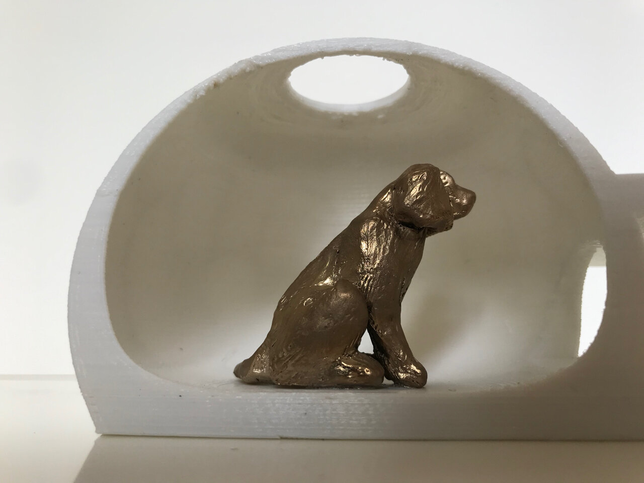
BarkHaus is an invite only, design and build competition including 14 architects charged with the duty to design an interpretation of a modern-day dog house.  

The designs will be on display at Ponsonby Central from 21 September and open to the public to exercise their democratic muscle and vote for their favourite.  

Screen Shot 2019-09-13 at 1.00.25 PM.png
 
Our design ‘Jofi’s Cave’

Our design ‘Jofi’s Cave’

Inside ‘Jofi’s Cave’

Inside ‘Jofi’s Cave’

After two long arduous weeks of checking social media “likes” the three most popular designs will be built full-size.  Then leveraging off every channel in the social media domain, Ray White real estate will promote the heck out of them, holding a series of ‘doggie open homes’ back at Ponsonby Central. 

www.barkhaus.co.nz

Finally the artistic masterpieces will be auctioned off to the highest bidders at a gala charity event, to be held at the Sapphire Rooms above Ponsonby Central.
The proceeds are all donated to charity.
 
Vote for us! 

Journal | September 2019

Under construction | Domaine Thomson Winery

Domaine Thomson Wines To Open An Historically Inspired Wine Tasting Facility.

DT LOGO ONLY.jpg


Noel lane and R B Studio have been working together on a wine tasting building for Domaine Thomson.  Tendered to Breen Construction of Alexandra, the project in Clarks Road, opposite Pisa Moorings in the Cromwell Basin, housing a tasting room, entertaining spaces, a cellar and office is currently underway.

Click here to read the press release

The Domaine Thomson label honours David Hall-Jones’ great-great-grandfather John Turnbull Thomson, the first surveyor to explore most of Otago and Southland in the 1850s in his capacity as chief surveyor of Otago.  “He named many well-known landmarks including Mt Aspiring, Mt Earnslaw, Lindis Pass and the Pisa Range,” says David. “Having our buildings nestled beneath the Pisa Range, on our bio-dynamically managed 14-hectare Pinot Noir vineyard, is very meaningful to us because of the pivotal part Thomson played in the history of the area.”

Domaine Thomson Central Otago wines are available from the website www.domainethomsonwines.com and from Maison Vauron in Auckland.

Click on below image to view a timelapse clip of the work progress.


Journal | September 2019

Publicity | Archipro feature - Volcano House is Archipro project of the Month

Extract: “I think we are becoming more interested in the history and materiality that is available in New Zealand and this house uses local stone and native timbers that have a real patina and richness we can’t import… It gives you a sense of New Zealand’s unique identity.” Tom Rowe, senior Architect director

Read the full Archipro project of the month article here

Click on below image to view the video on our Volcano House project


Journal | September 2019

The Model


From the monuments of Egypt to the medieval cathedrals of Europe, the culture of model making is a practice dating back thousands of years perhaps even before drawing. Model making remains an established method of testing scale, volume light and proportion. The model crystallises the plan and space and deliver a realistic interpretation of relationships to the site, the landscape and built urban features. The methods of construction and prototyping may have shifted, however the underlying substance of a model remains a compelling medium.

 
LAKE+HAYES+MODEL+CROPPED.jpg
 

Within architectural academics the subject of representation versus ontology remains a constant debate. Ontology means the study of “being" from the greek word Ontos. A model uniquely conveys “Ontos” perhaps redefined as a sense of scale. It cannot be fudged and is there for all to “experience”.

Recently in celebration of my daughter's birthday we took her and a friend to a virtual reality studio. The experience involved donning a headset and strapping on hand controls and flying as an eagle in tandem with other “eagles” through a post apocalyptic ruin of Paris. I’ve proudly never been any good at video games and the experience while a little immersive didn’t really stimulate my imagination for this post apocalyptic world. The problem is that there is too much image and not enough substance.

While cultural commentators continue to predict the sudden, rapid, inevitability of virtual reality, I remain convinced that the model will endure as a method vastly superior at conveying an imagined architecture.

 
Barkhaus mode; 2 IMG_5034.jpg

Journal | March 2019

Bruder Klaus Chapel by architect Peter Zumthor

 
IMG_9888.jpg

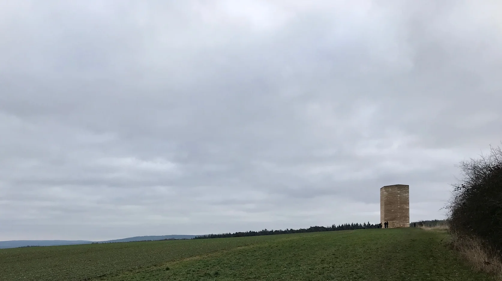
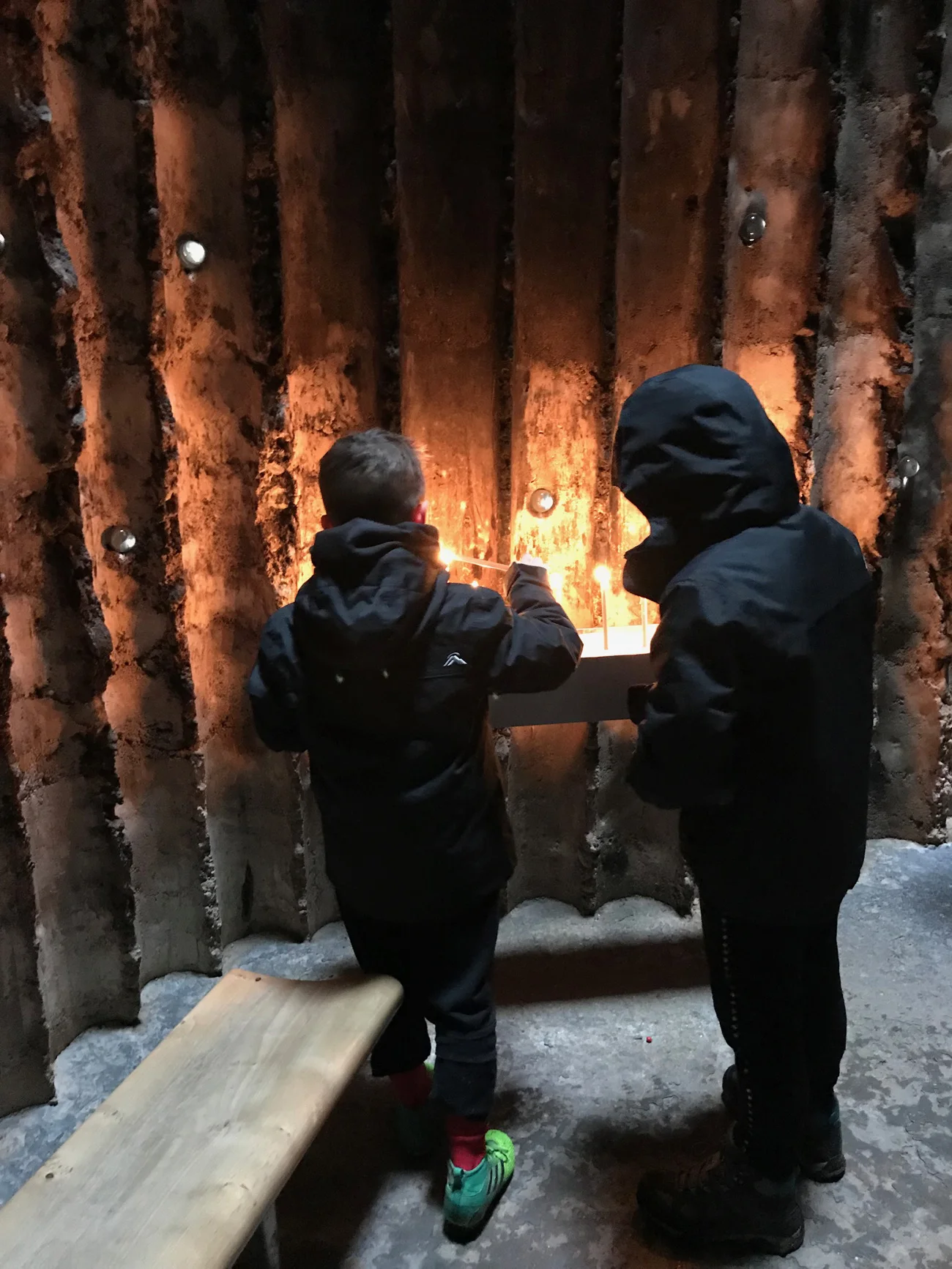
Bruder Klaus Chapel (by Peter Zumthor) is a small chapel sited on a lonely paddock of a small provincial German village. The Chapel was constructed in reverse, burnt from the inside out. The process involved attaching 112 tree-trunks together in a spiral form and constructing a concrete shell built up around the logs. The logs were then set on fire and burnt out to form a hollow interior with an opening to the sky.


3of1.jpg
2of1.jpg
 
4of1.jpg
6of1.jpg
 
5of1.jpg

Journal | March 2019

Kolumba by architect Peter Zumthor

 
1of2.jpg
2of2.jpg

Kolumba is an art museum by the contemporary Swiss architect Peter Zumthor. A seeming delicate perforated brick facade forms an exterior skin to the street while allowing soft dappled light to the archaeological remains of a Roman church inside. This was designed and built over a 17 year period (completed 2007). Zumthor is recognised within the profession as one of the few “starchitects”. An enigmatic, reclusive, rock-star architect who consistently builds immaculate innovative projects around the world.

 
5bof2.jpg
5of2.jpg
 
4of2.jpg
4bof2.jpg
 
5cof2.jpg
6of2.jpg
 
7of2.jpg

Journal | March 2019

Notre Dame du Haut chapel by Le Corbusier

 
1of3.jpg

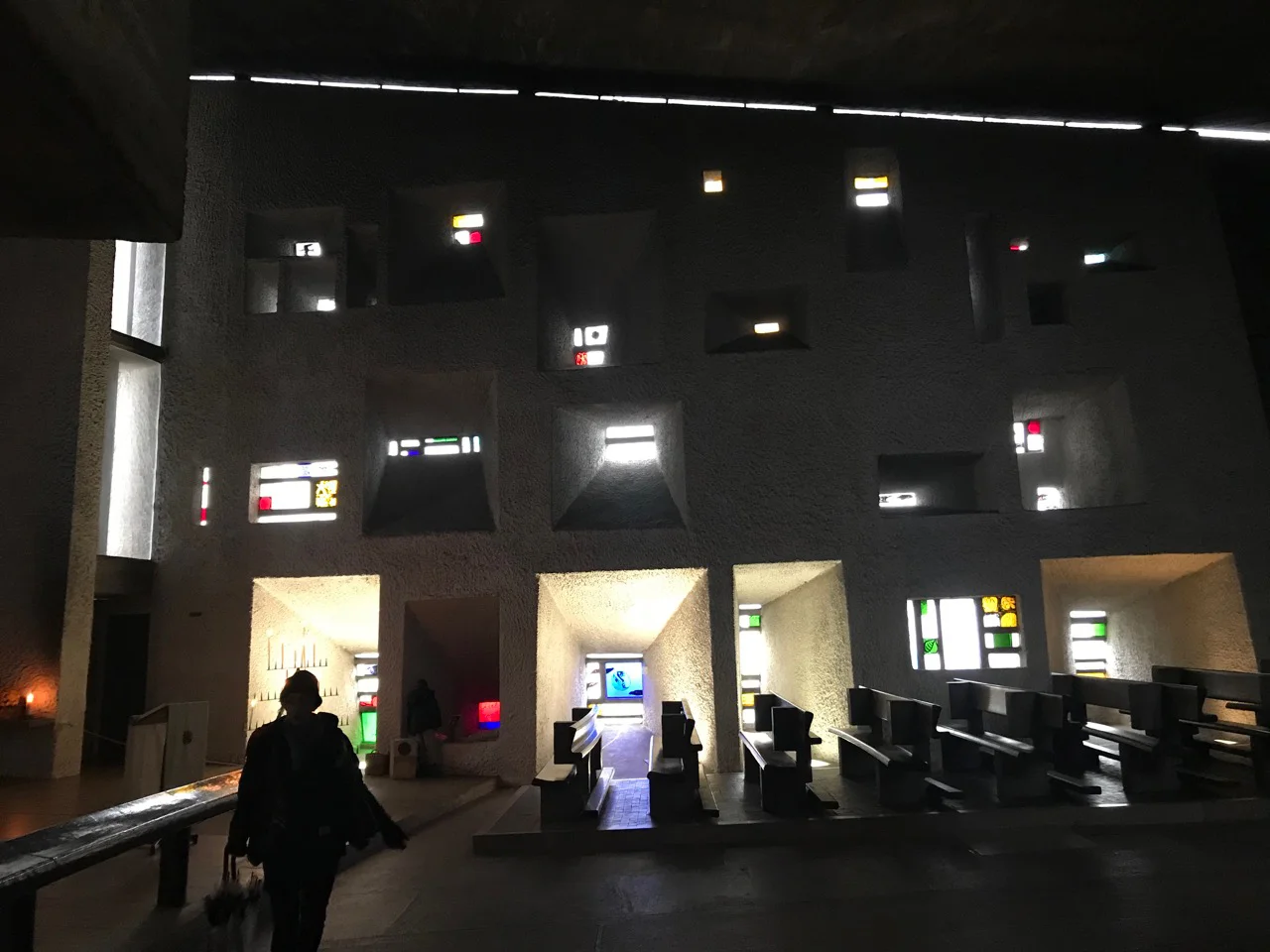
The Notre Dame du Haut Chapel in Ronchamp is the masterwork of the celebrated 20th Century architect Le Corbusier. It is located in the middle of France and while it is difficult to get to, it is well worth the journey. We were there alone on a misty day.


2of3.jpg
 
3 of 3.jpg
4 of 3.jpg
 
5 of 3.jpg
6 of 3.jpg
 
7 of 3.jpg
8 of 3.jpg
 
9 of 3.jpg
10 of 3 canvas rotated.jpg

Journal | February 2019

Home of the year 2019

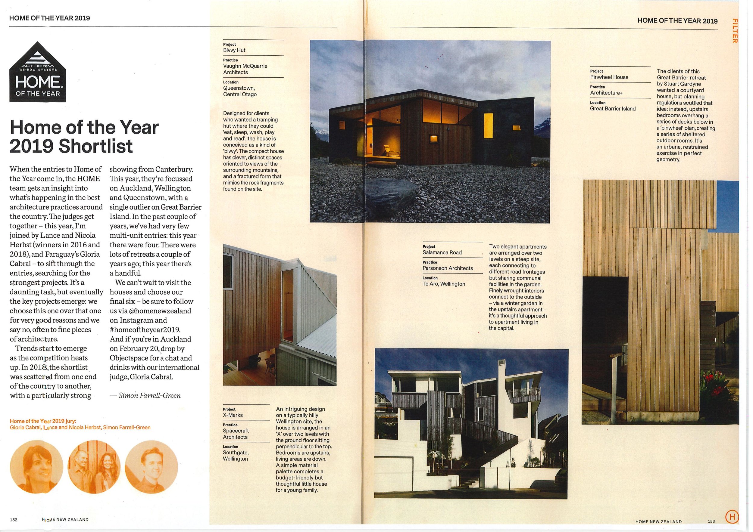
It is a real privilege and pleasure to have one of our projects shortlisted for the Home Magazine, Home of the Year award. Only 10 homes in New Zealand were shortlisted for the 2019 award and the judging was completed a couple of weeks ago by the esteemed New Zealand architects Nicky and Lance Herbst as well as the highly awarded architect, Gloria Cabral from Paraguay. Gloria was in New Zealand speaking at the New Zealand Institute of Architects conference and is known for her innovative work with delicate brick construction. The awards are announced in the April issue.

To view the 10 selected projects click here and here.

Home+mag.jpg
 
 
rescan -1.jpg
rescan -2.jpg

Journal | September 2018

The Plan


A good plan is clear.

It’s easy to understand, to comprehend both as an abstract drawing and as a built form. Good plans come from revising and reworking over initial concept plans until the spatial relationships are attuned both internally and externally.


Volcano House Plan.jpg
 

Good planning demonstrates the values of efficiency, economy and clarity, often as a result of many hours of sketching and redrawing, finally leading to a diagram of distilled refinement.

A good plan is rational, logical, natural and instinctive.

It contributes to economy of space and is lean like an athlete to serve its purpose. It is generous with spatial relationships between volumes and activities.

Le Corbusier, the Swiss modernist famously claimed that:


The plan is the generator […] It is a plan of battle […] The battle is composed of the impact of masses in space and the morale of the army is the cluster of predetermined ideas and the driving purpose. Without a roof plan nothing exists, all is frail and cannot endure. All is poor even under the clutter of the richest decoration.

The plan is the generator. Without a plan you have a lack of order and wilfulness. The plan holds itself the essence of sensation.”


Journal | May 2018

2018 NZIA Auckland Housing Award for Volcano House

We are delighted to announce success in receiving a New Zealand Institute of Architects Auckland regional award in the Housing category, for the design of the Volcano House. The awards evening was Wednesday night and was a celebration of local architecture with some excellent buildings showcased.


Click the above image to view the project in its entirety.

Read more in this extensive article by Colleen Hawkes on Stuff.co.nz

NZIA Jury Citation: “Tucked away down a discreet right of way, this comfortable courtyard house exhibits a profound calmness. Natural New Zealand materials — basalt from Mt Horrible and tōtara retrieved from rivers in Northland — have been beautifully composed within a clear schema of linked, stone-clad spaces. This is an elegant pavilion perfectly suited to the clients and their collection of art.”

 
AH2981.jpg
 
NZ Awards Display Volcano.jpg
 

Journal | February 2018

Summer Newsletter

Recently Completed

Volcano House

Located in proximity to one of Auckland’s volcanic cones, the site is enclosed by adjacent suburban gardens and micro-utopia. The plan is introspective with living areas centred about a courtyard opening to subcourtyards. Rooms are grouped according to their function and program, and these groups are conceived of as a collection of boulders defining the boundary of the building.

Click the image below to view the project in its entirety.

AH3197.jpeg
 

Recently Photographed

Point House

The house naturally takes advantage of views to the ‘waka superhighway’ of Auckland, a historic motorway for canoes in-between the Manakau and Waitemata Harbours. Following an “L” shape plan and enclosing a courtyard protected from the sun and winds, as well as the public view from the adjacent park, the house is orientated with a pavilion for living areas to the North, and bedrooms facing east to a lawn and inner garden.

Click the below image to see the project in its entirety.


Journal | October 2017

Technology

Point Cloud

We have recently been working with point cloud technology, which is effectively a 3D scan of an internal space or exterior, picking up detail and colour with millimetre accuracy.

This technology is invaluable with historic and renovation work enabling accurate surveying of complex, difficult geometry right down to the detail of light switches, smoke alarms and detailed skirtings, mouldings and scotias.


Screen Shot 2019-01-21 at 2.57.38 PM.png


In addition to the capture of this information, we can also model new proposed interventions alongside the 3D survey, enabling fast and effective concepts to be conveyed in an accurate manner. The price is relatively cost effective and removes the significant time involved in measuring and recording site dimensions.

We see this as a technology that will significantly influence the future of both design and documentation of “as built” structures and services, particular in large and complex projects.


Laser Cutting

We extensively utilise laser-cutting technology in the construction of our 3D physical models. We enjoy the tactility, form and perception of space that comes from making physical models. The laser-cutting technology allows us to apply texture and even detailed fenestration to models. Site models can be produced with accurate ease, and we are currently exploring further possibilities using CNC Router technology to recreate complex landforms more accurately on small scale.

Model+Photo+Three.jpg

Journal | October 2017

Recently Opened: Sculptureum

 
LibbyRobinson-Sculptureum-web-75 copy.jpg
 

This was an evolutionary project manifesting as a museum, function centre, bar and restaurant. The collector has spent significant time and energy collecting and collating work for both indoor and outdoor exhibition. Award-winning wine is grown on the site and is available for purchase. There is also an acclaimed fine-dining restaurant.

Photography by Libby Robinson.

Visit the Sculptureum website here…

 
LibbyRobinson-Sculptureum-highres-30 copy.jpg
 
LibbyRobinson-Sculptureum-web-94 copy.jpg
 
LibbyRobinson-Sculptureum-highres-5 copy.jpg
 
LibbyRobinson-Sculptureum-web-100.jpg
 
LibbyRobinson-Sculptureum-web-133.jpg
 
LibbyRobinson-Sculptureum-web-136.jpg

Journal | October 2017

Material Selection

The gourmet feast that surrounds material selection and application in architecture is inexhaustible and truly mouth-watering. While new materials are constantly being developed, durable and timeless materials seems to be a more robust choice, both practically and aesthetically. In his recently released book “Principles,” Ray Dalio propounds the idea that:


The new is overvalued relative to the great…in my opinion, it is smarter to choose the great over the new.” (Dalio, 2011)


Similar to the use of colour in graphic design, the experience and aesthetic of architecture seems to exhibit more cohesion when the material pallet is more selective and controlled. Peter Zumthor, the preeminent Swiss architect, expands on the matter:


“I try to make sure that the materials are attuned to each other, that they radiate; I take a certain amount of oak and different amount of pieta serena and add something to them: three grams of silver or a handle that turns or maybe surfaces of gleaming glass, so that every combination of material yields a unique composition. (Zumthor, 1998)


AH3031.jpeg
AH3014.jpg

We have a powerful and multi-sensory memory of past encounters with different materials. A single material can come in many sizes, shapes, colours and textures. These variations can affect the acoustics, the temperature, the way the light is caught, the way the shadows are cast, and ultimately the way we feel, perceive and act. Each material has its own historical and cultural significance inherited through generations of making and use. In this way, traditional materials engender a powerful vernacular that may come to symbolise any number of things, from power and prosperity to poverty and piety. Hence Nietzsche’s familiar dictum:


Stone is more stony than it used to be. (Nietzsche, 1878.)


Overwhelmingly, this principle carries across time and place. From the Turkish baths of Istanbul, castles in Scotland, Gothic cathedrals of France to much more contemporary structures, each demonstrate how materials chosen contribute to the overall integrity of the structure, allowing the character of the building to come to the fore without resorting to token gestures or frivolous feature walls. Materials have their own properties and personalities which must be recognised and respected if they are to enter a more meaningful dialogue with their time and place. This is perhaps best expressed by the famous modern American architect Louis Kahn:


“You say to a brick, ‘what do you want, brick?’ And brick says to you, ‘I like an arch.’ And you say to brick, ‘Look, I want one too, but arches are expensive and I can use a concrete lintel.’ And then you say: ‘what do you think of that, Brick?'

Brick says: “I like an arch.”


Journal | October 2017

Site Selection

Recently I had a discussion with a client around Site Selection, an activity for which architects have typically been immersed and engaged with. The challenge historically was to identify the “Genius Loci” or "spirit of a place", a practice globally widespread across all cultures particularly in a historic and mythological context.

From European sacred buildings occupying sites of importance and dominance, to cities such as Tokyo located with a mountain range behind for protection and facing the sea as a source of commerce and prosperity. Beijing’s famous Forbidden City site was “designed” with the spoils of the earthworks from the surrounding moat being deposited to form a hill behind, both for perceived protection as well as evocative of the mythical tortoise in traditional Feng Shui- but clearly providing shelter from the cold North winds.


043A7572-Pano.jpg
 

Vitruvius, the famous architect and author on the subject published "10 books on architecture" 20-30BC, which for many years were used as the textbook for site selection. Many of these principles hold true today as do his three most important values, firmitas, utilitas, venustas; literally firmness, commodity and (aesthetic) delight. His view on site selection follows:


“It should be elevated, not cloudy, not liable to frost, facing those regions of the sky which are neither hot nor cold but temperate. In addition, if at all possible, proximity to swamps is to be avoided.” ( Book 1 )


It is generally recognised that these books were not solely a result of Vitruvius’ observations and fascinating that the subject and these values seem both timeless and to reflect "a universal truth".


Journal | February 2017

Publicity | Stuff.co.nz feature

Extract: “Century-old villas in the city are often close together and that's part of the heritage character of our older neighbourhoods.

But it can pose a design challenge when you want to extend your house but don't wish to overlook the neighbours.

Auckland architect, Tom Rowe and designer Saskia Baetens, have come up with the perfect solution for their own family home in a protected heritage street in Sandringham…”

Read the full article here


Journal | November 2016

Publicity | Houses Magazine Feature

Extract: “ There’s a common misconception that architecture has to be big and extravagant and opulent to be big and extravagant and opulent to be succesful or desirable. Not true. These two idemtical cabins, on a protected piece of coastline in the Bay of Islands, have a sense of craft and scale that belies their size. In conceiving this project, architect Noel Lane in association with architect Tom Rowe, has delivered a pair of gems that just make you want to climb in your car and head North…”

To read the article click on the image below.


Click on the cover above the view the feature.

Journal | May 2016

Autumn Newsletter

Awards

NZIA Auckland Awards 2016

We are delighted to announce success in receiving a NZIA regional award in conjunction with Noel Lane Architects for the design of two small seaside cabins. The awards evening was held last Thursday and was celebration of local architecture with some excellent buildings showcased.

These two seaside cabins are cut into the hillside twenty meters from a small, intimate beach in the Bay of Islands. They are suited facing Northeast, concealed and immersed within the native bush of the terrain.

Click the image below to view the project in its entirety.


News

Houses Magazine Feature

Extract: “"In keeping with the architect’s goal of keeping the space simple, there are no reflective surfaces in the kitchen. The cabinetry is matt and the granite, honed finishes that are serviceable and forgiving of children’s fingermarks. This simplicity has not been gained at the expense of functionality, however.

All the usual appliances are here, and there’s a large pantry and small appliances area hidden behind two large sliding doors next to the fridge… Artificial light is achieved through direct, narrow-beam spots recessed high into the ceiling directly above the island bench-top, casting light only onto work surfaces and carefully placed to avoid shadow."

 
rowebaetens-houses_Page_1.jpg
 

Under Construction

Waiheke House

The house is cut into an incredibly steep site; a considerable component of the project was to being and sculpt the mass of the landscape to create an even grade and form a landscaped terrace under an existing pohutakawa tree to the north of the house.

 
DSC01319.jpg

Journal | October 2015

Concept | Gore Tulloch Park

 
Renders I-VI [Updated]-6.jpg
 

Tulloch Park in Gore is about to undergo considerable redevelopment. Central to this is the transformation of the indoor swimming pool into an exciting new recreation centre featuring an indoor bike and skate park.


Renders I-VI [Updated]-2.jpg
 
Renders I-VI [Updated]-3.jpg
 

Recreational facilities planned right across the park include community bike/go-kart repair and costumisation workshops, multipurpose tennis/badminton/basketball courts, pump track and junior pump track with tunnels, a coffee-or refreshments kiosk, a mini-golf and pavilion shelter, a jogging track with exercise stations, picnic areas, a children’s slide/water play park, a climbing net, BBQ and sheltered outdoor areas.

 
Renders I-VI [Updated]-4.jpg
 
Renders I-VI [Updated]-5.jpg
 
Renders I-VI [Updated]-7.jpg

Journal | July 2014

Publicity | Houses Magazine Feature

Extract: “ In an area imbued with history comes a modern incarnation…”

To read the article click on the images below.


Journal | October 2012

Publicity | INTERIOR Magazine Feature

Extract:The best dining experiences are those that captivate a number of senses – not just the taste buds, although, of course, what the taste buds think defines success or failure for any restaurateur. But given that the competition for the fine dining dollar is intense, how does one restaurant differentiate itself from another. At James, the answer is as clear as day and night – the visual aesthetic, devised by architects Noel Lane and Tom Rowe, is based on dichotomy; light is divided from darkness, and there is compression and decompression as a low volume opens into high…

To read the article click on the images below.


Journal | October 2017

Spring Newsletter

Recently I had a discussion with a client around Site Selection, an activity for which architects have typically been immersed and engaged with. The challenge historically was to identify the “Genius Loci” or "spirit of a place", a practice globally widespread across all cultures particularly in a historic and mythological context.

From European sacred buildings occupying sites of importance and dominance, to cities such as Tokyo located with a mountain range behind for protection and facing the sea as a source of commerce and prosperity. Beijing’s famous Forbidden City site was “designed” with the spoils of the earthworks from the surrounding moat being deposited to form a hill behind, both for perceived protection as well as evocative of the mythical tortoise in traditional Feng Shui- but clearly providing shelter from the cold North winds.


043A7572-Pano.jpg
 

Vitruvius, the famous architect and author on the subject published "10 books on architecture" 20-30BC, which for many years were used as the textbook for site selection. Many of these principles hold true today as do his three most important values, firmitas, utilitas, venustas; literally firmness, commodity and (aesthetic) delight. His view on site selection follows:


“It should be elevated, not cloudy, not liable to frost, facing those regions of the sky which are neither hot nor cold but temperate. In addition, if at all possible, proximity to swamps is to be avoided.” ( Book 1 )


It is generally recognised that these books were not solely a result of Vitruvius’ observations and fascinating that the subject and these values seem both timeless and to reflect "a universal truth".


Under Construction

Volcano House

Located in proximity to one of Auckland’s volcanic cones, the site is enclosed by adjacent suburbia and micro-utopia. The plan is introspective with living areas centred around a courtyard opening to sub-courtyards. Rooms are grouped according to their function and programme; these groups are conceived of as a collection boulders defining the boundary of the building.

DSC04170.jpg
Model Image Two.jpg
 

Crouching Tiger

Concealed within the centre of Remuera, this three-story house is both firmly anchored to the ground while extending cantilevered rooms doubling as functional covered living areas. The approach optimises floor area to the site and footprint both for economy and aesthetic. A challenge was to connect living areas logically in north with views across towards to the existing pool area to the south.

DSC05172.jpg
 

Recently Publicity

The following image is a link to a recently published article in Trends magazine on our ‘City Villa’ project. This was awarded a highly-commended accolade in the Trends International Design Awards of 2016, under the Renovations category. Northland Lake House was awarded first place in this same category.
Journal | May 2018

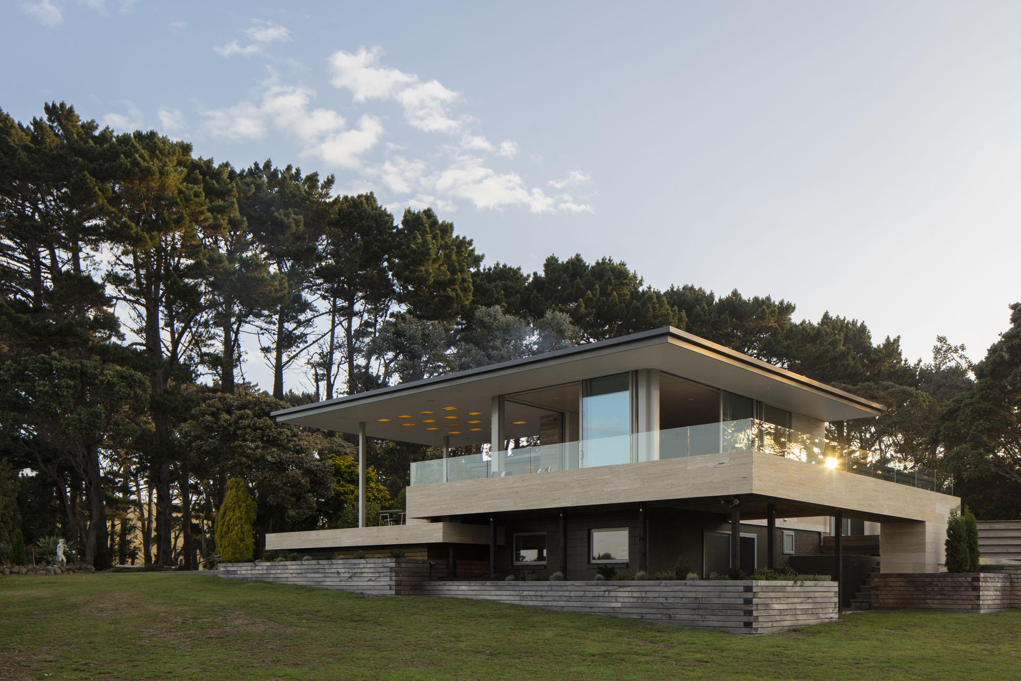
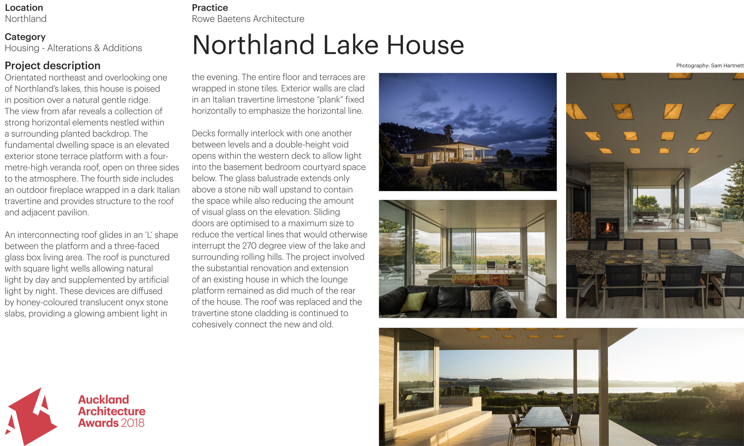
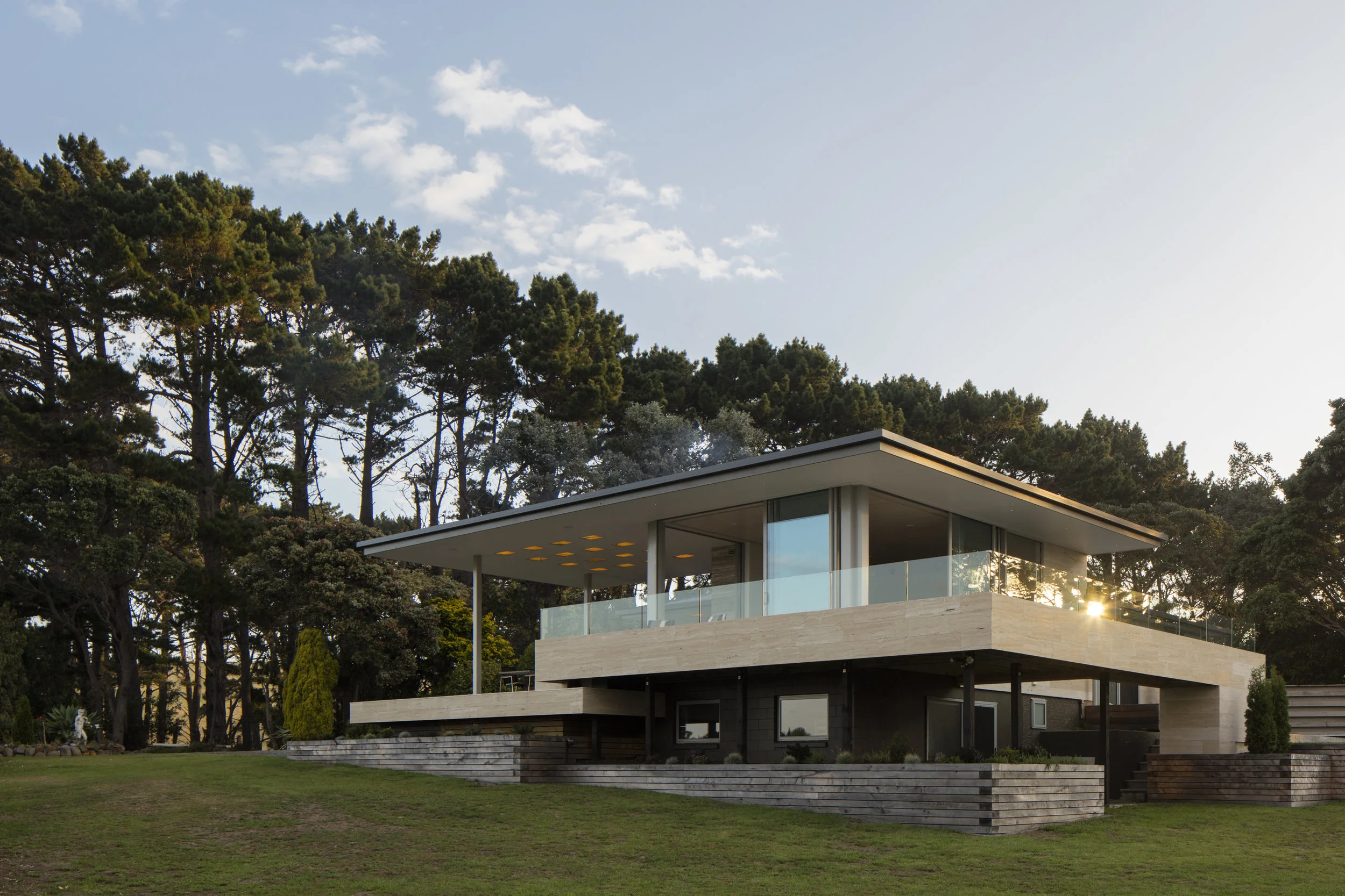
2018 NZIA Auckland Housing Alterations and Additions Award for Northland Lake House

We are delighted to announce success in receiving a New Zealand Institute of Architects Auckland regional award in the Housing Alterations and Additions category, for the design of the Northland Lake House. The awards evening was Wednesday night and was a celebration of local architecture with some excellent buildings showcased.


Click the above image to view the project in its entirety.

Read more on the Northland Lake House and other awarded projects in this Architecture Now article…

NZIA Jury Citation: “The extensive use of stone is an appropriate showcase for the client’s professional expertise, and a covered outdoor room, top-lit with onyx marble, is a useful and well-used space. Extensive views of the lake have been achieved by raising the new living area platforms above those of the existing house.”

 
043A7467.jpg
NZ Awards Display Northland_Lake.jpg

Journal | April 2017

Autumn Newsletter

Completed Projects

Warkworth Bank Corner

The BNZ Bank Corner project is now complete. The concept involved creating a pedestrian lane that separates the new commercial block from the existing historic bank building, while generating a link between Neville Street, Warkworth Street and the adjacent car park.

Click the image below to view the project in its entirety.

 
web-7009.jpg
 

Waiheke Coastal Retreat

Cut into a steep terrain and overlooking the coastline of Waiheke, this house harmonises with the landscape while extending a platform towards the sea. The roof is an offset, upside-down truss form, minimising the bulk within the landscape. An upper-level breezeway is revealed on entry through 3.5m barn doors, providing shelter.


Awards

Trends International Design Awards

In November last year, our project ‘Northland Lake House’ was awarded winner of the Trends International Design Awards for best renovation in New Zealand.

Our projects ‘City Villa’ (Renovation) and ‘Seaside Cabins’ (New Home) were also awarded as highly commended in the Awards.

 
043A7467.jpg
 
 
_43A5125-Pano.jpg
_43A6691.jpg
 

Magazine Feature

In January this year, Trends Magazine (Edition 32) featured an extensive article on the ‘Northland Lake House’ project - our first cover!

Excerpt: “…Undertaken by architect Tom Rowe, this major home transformation was a game of two halves. The rear section of the home — a surveyor’s cottage in another life — was partially retained, with rooms reshuffled to create a new kitchen, dining areas and bedrooms. This was clad afresh in Italian travertine stone and a brand-new traditional sloping roof was introduced. However, the front end of the hose has been spectacularly re-invented…”

 
043A7496.jpg

Journal | October 2015

Spring Newsletter

Proposed Projects

Impluvium House

A new extension to an inner city villa that provides introspective calmness and privacy while allowing light and ventilation. The house borrow an impluvium from the language of classical roman Pompeii, a device that was used to introduce air and light to house too small for a full-sized courtyard. The windows are carefully set out to provide strategic views of gardens and avoid sight of neibouring suburban structures. In plan the house extension is similar to its bay villa typology at the front with an extended bay windows and corresponding veranda executed however with crisp lines and careful detailing. The house will have a heated limestone floor and is otherwise fundamentally a volume, form, mass and space.

 
cam05.jpg
cam08.jpg
 

Under Construction

Seaside Bungalows

We are at the tail end of construction of two seaside units located in the bay of islands overlooking a private beach. The project is in conjunction with Noel Lane Architects, and follows a refined rustic aesthetic with deliberate constructivist connections. The houses are identical with roof glazing that enables a lightness and connection to the bush above as well as the immediate shoreline 20 meters away.

 
McConnell mock up.jpg
 

Recently Completed

Point England House

The house naturally takes advantage of views to the ‘waka superhighway’ of Auckland, a historic motorway for canoes in-between the Manakau and Waitemata Harbours. Following an “L” shape plan and enclosing a courtyard protected from the sun and winds, as well as the public view from the adjacent park, the house is orientated with a pavilion for living areas to the North, and bedrooms facing east to a lawn and inner garden.

 
_43A6225web_edited.jpg

Journal | March 2020

Publicity | Archipro feature - Interview with Tom Rowe

Recently ArchiPro asked us to comment on Sunlight in New Zealand (This is another obsession architects are constantly discussing and describing). Link to the article.

1. How would you describe New Zealand's sunlight? 

While at architecture school, I had a professor who asserted there were two distinctive responses to light manifesting in art of the Renaissance.The Florentine school were interested in “line” due to the harshness of their sunlight and shadow. They correspondingly became adept and fascinated with sculpture and strong gutsy line drawings. The Venetian school were interested in “tone” due to the misty atmospheres of Venice and became experts in painting, glass and fabric design.  
In New Zealand, I would describe our light as characteristically diffuse, luminous and crystalline. Over summer we do have extremely sharp and “Florentine" moments at the zenith with a real sense of clarity and purity. But this is probably the exception rather than the rule. 

2. What key suggestions you have for making a house feel sunny and warm all year long?

 In classical times, the Romans planned with an inherent knowledge of light manifesting in their impluviums within the Villas of Pompei, their occuli in the Pantheon, as well as its smaller and less grandiose sisters. They applied these tools to create ambient light even in densely populated areas. Today this takes shape in the cities as skylights, low level windows and as well as small courtyards that pool with light connecting a home to the environment.In the landscape, pavilions with deep eaves allow for an all season panoramic enjoyment of the sun and diffuse daylight most consistent with traditional Chinese and Japanese architecture.  

3. What key considerations and research do you undertake when examining how the light might interact with one of your house designs? 

We design for the environment, often to maximise sun in the winter and maximise shade in the summer. Typically this involves planning  deep eaves interlinked with courtyards, light shafts and skylights. We also research materiality, investigating the effects of light onto surface texture and the substance of material. As an example, travertine marble or onyx have a luminosity beyond the surface that creates a sense of resonance and a subtle glow.  

4. With Northland Lake House, what is the concept behind the outdoor rooms and extending eaves, and the way you've covered it with this awesome hovering roof, incorporating lit cubes in the ceiling, and ensuring you draw light into the home at the same time? 

The roof wraps around a central fireplace core (that braces the structure) and then the roof “lifts off”. Free from the main part of the existing house, this gives a sense of shelter without compromising the view of the lake and landscape. The Russian constructivist architect, El Lissitzky was famous for his Wolkenbugel, “cloudball” project. In simple terms it is, “Look no hands”. Light in this project also filters in a similar manner down to a lower level bedroom courtyard between the deck and a bridge that is set free from the structure. The illuminated cubes in the ceiling are onyx, a warm coloured translucent stone, they have a clear plastic roof over them and are also backlit for nocturnal diffuse ambience.  

 5. Have you encountered any surprises when planning around sunlight

Mechanically, we typically undertake sun studies at 9am, 12noon, 3pm and 5pm on the equinox, and the shortest/longest day. We do this with drawings rather than using animation, as it gives us an opportunity to interrogate the digital model. An interpolation of the result gives us the general ambience of the effect of sunlight. Water is always a surprise and while we have deliberately designed reflection pools in some of our houses, our coastal projects often have an activated dynamism as a result of the coastal environment.   

 
Lake House

Lake House

Journal | November 2016

2016 NZIA Auckland Awards

We are delighted to announce success in receiving a NZIA regional award in conjunction with Noel Lane Architects for the design of two small seaside cabins. The awards evening was held last Thursday and was celebration of local architecture with some excellent buildings showcased.

These two seaside cabins are cut into the hillside twenty meters from a small, intimate beach in the Bay of Islands. They are suited facing Northeast, concealed and immersed within the native bush of the terrain.


Seaside Cabins | Small Project Architecture Award

NZIA Jury Citation: “Two cabins are better than one, particularly when they are thoughtfully placed on the edge of the beautiful beach that discreetly conceals them. One sits higher than the other, offering careful views into the exterior shower zone of the other - a take on public-private zones that reinforces the intimacy and play for which cabins are designed. These cabins are best considered from the sea and then from the naturally lit bathrooms to the rear of the sleeping zone. They are a privileged act of hedonism, simply duplicated.”

Click the above images to view the project in its entirety.

Journal | February 2016

Publicity | Home Magazine Feature

Extract: “The Pool is built on a platform surrounded by a wall of local stone. Behind the wall is a planted trench, allowing clear view from the pool area to the shore. This fence rises on the entry side the pool to a gate attached to the cedar-clad pavilion. The wall continues around the back of the pool, where it is carefully concealed with new planting. ‘There's no glass, there’s nothing shiny about it.’ Rowe says. ‘Everything is patinated, and will continue to do so over time. There’s a quality in terms of tactility and endurance.”


Click on the cover above the view the feature.

Journal | February 2016

Publicity | Houses Magazine Feature

Extract: “ In a living space that’s been carefully crafted and curated, it’s important that the kitchen doesn’t compete with its surroundings, rather it enhances them. In this respect, architect Tom Rowe had a very clear vision of the look and functionality of the kitchen seen on these pages….

…When we asked the architect Tom Rowe what the inspiration was behind these twin bathrooms he smiled and came back with a quote from one of New Zealand’s favourite sons Ernest Rutherford: “we didn’t have much money, so we had to think….””

To read both articles click on the images below.


Journal | December 2015

Publicity | Tom Rowe - Houses Magazine Feature

Houses editor Justin Foote talks to architect and self-confessed ‘architecture chaser’ Tom Rowe about finding atmosphere in the built spaces around us.

Five wonderful projects by Tom Rowe are presented with images and floor plans.

To read the feature click on the images below.


Journal | October 2015

Concept | Gore Tulloch Park

 
Renders I-VI [Updated]-6.jpg
 

Tulloch Park in Gore is about to undergo considerable redevelopment. Central to this is the transformation of the indoor swimming pool into an exciting new recreation centre featuring an indoor bike and skate park.


Renders I-VI [Updated]-2.jpg
 
Renders I-VI [Updated]-3.jpg
 

Recreational facilities planned right across the park include community bike/go-kart repair and costumisation workshops, multipurpose tennis/badminton/basketball courts, pump track and junior pump track with tunnels, a coffee-or refreshments kiosk, a mini-golf and pavilion shelter, a jogging track with exercise stations, picnic areas, a children’s slide/water play park, a climbing net, BBQ and sheltered outdoor areas.

 
Renders I-VI [Updated]-4.jpg
 
Renders I-VI [Updated]-5.jpg
 
Renders I-VI [Updated]-7.jpg

Journal | October 2015

Concept | Gore Hokonui Moonshine Museum


Moonshine [n]:

‘“illicitly distilled alcohol, principally whiskey, concocted away from prying eyes in the cover of darkness and the light of the moon.”

From the street front the building is presented in it’s Sunday best offering the appearance of a proud, upstanding element of colonial New Zealand. But all is not as it appears and like the beguiling appearance of the moonshiners themselves, this building has also a darker side. Walk behind the pristine white picket fence, beyond the delicate ornamental fretwork, and the structure crumbles into something far more dishevelled and discourteous: a smoky, rusticated, ramshackle structure lurches out at an oblique angle from the main building.

 
601+Perspective.jpg
 

This is the new distillery and an important part of the redevelopment of the existing museum. Perhaps the most exciting element, however, is the distillery, where the whisky is created using the original nineteenth-century methods. During the day visitors may view the distillers at work from within the museum but at night the only suggestion of activity is the curious golden glow that seeps out between the planks of the boarded up windows.

 
605+Layout.jpg
 
602+Layout.jpg
 
603+Layout.jpg
 
604+Layout.jpg
 
606+Layout.jpg
 
607+Layout.jpg

Journal | May 2015

2015 NZIA Auckland Awards


In association with Noel Lane Architects, we received two New Zealand Institute of Architects Awards: a ‘Hospitality and Retail’ Award for the James Restaurant project, and a ‘Small Project’ Architecture Award for the Pool Pavilion Project. We would like to thank our clients and all consultants and contractors who contributed to both projects.


James Restaurant | Hospitality Award

NZIA Jury Citation: “Less is indeed more in this energising response to an old site with its double-height volume and concrete-formwork walls. A gesture as simple as hanging swathes of hot-pink sheer curtaining which can be arranged to configure a series of intimate ‘rooms’ or to frame the entire space, is exactly the right, inspired decision. Coming from the near pitch-black bar area, the room is an explosion of eye-popping, fun colour and a great environment for a party.”

Click the above image to view the project in its entirety.


Pool Pavilion | Small Project Award

NZIA Jury Citation: “This well-considered and finely crafted project draws its greatest strengths from the architect’s understanding of how sometimes restraint and excision can deliver more than enough. The pool and its associated structures form a series of basic elements, articulated with simplicity and resolved with great elegance. Tiles, paving, a skeletal canopy structure and beautiful planting work with the water surfaces to provides an amply sufficiency of elegance and pleasure. This is the kind of place where it is very easy to imagine that James Bond, no doubt suitably accompanied, could be filmed.”

Click the above image to view the project in its entirety.

Journal | October 2014

Publicity | DESIFN FOLIO feature

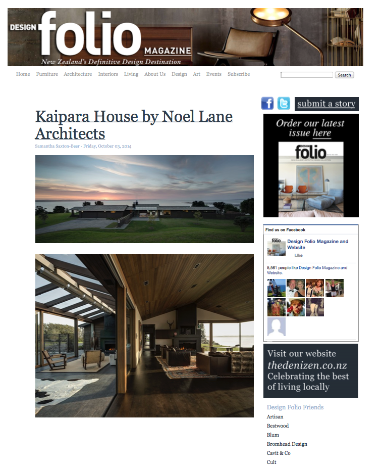
Extract:Nestled on a rural, waterfront location North West of Auckland is the Kaipara House designed by Noel Lane Architects, senior architect Tom Rowe. Conceived as low-lying bach to empathise with its expansive setting, the home is finished with natural materials including cedar weatherboard cladding and hand-split western red cedar shakes for the shingle roof. Internally, honed granite and basalt are used together with oiled oak flooring and a stained cedar TGV ceiling. The Arclinea kitchen features an island that allows the cook take full advantage of the water view while entertaining guests.”

Click the image below to view the full feature.